-
WhatsApp +86 15116118247
-
Any Questions info@terrahats.com
Why Logo Placement Changes Visibility and Feasibility
Learn why crown, band, brim, under-brim and interior logo placements have different visibility, surface and production constraints.

Choosing a logo position on a straw hat is not simply a matter of pointing to the most visible area.
A placement can look prominent in a rendering yet offer too little stable, accessible space for the intended decoration process. Another location may be easy to decorate but receive little attention when the hat is worn. That is why every straw hat logo placement decision should be evaluated on two separate axes:
- Visibility: How, when and from which angles will the logo be seen?
- Feasibility: Can the selected artwork and decoration method be applied consistently to that part of the chosen hat?
Visible area is not the same as workable decoration area.
Crown curvature, seams, brim movement, material texture, internal layers and equipment access can all reduce the practical decoration zone. The right placement is not automatically the largest or most obvious one. It is the location that creates the intended visibility while remaining compatible with the actual product and production process.
Final feasibility depends on the selected hat style, decoration method, artwork, material stack and physical sample review.
Table of Contents
Visibility and Feasibility Are Different Questions
Visibility describes the logo’s relationship with the viewer. Feasibility describes its relationship with the hat and the decoration process.
A buyer reviewing visibility should ask:
- Is the logo meant to be seen in a direct front view, a side profile or during movement?
- Will the hat usually be viewed at eye level, from above or from below?
- Is the goal primary brand recognition, a secondary detail or an interior finishing touch?
- Could the brim, wearer’s head angle or surrounding trim interrupt the view?
A feasibility review asks a different set of questions:
- Is there a compatible zone for the artwork?
- Does curvature or a nearby seam change the design?
- Can the relevant equipment reach, hold and stabilize the area?
- Does the finished decoration still look and feel appropriate when the hat is worn?
Treating these as two axes prevents a common sourcing mistake: approving a location because it looks attractive on a flat digital mockup before confirming whether the physical hat supports it.
Front, Side and Back Crown Placement
The crown is often the first area buyers consider, but its different faces do not perform in the same way.
Front Crown: Direct Recognition, With Structural Limits
A front-crown logo usually offers the most direct view when the wearer faces the audience or camera. That can make it suitable for a primary brand mark, retail presentation, event uniforms and promotional use.
“Usually” matters. Front placement is not always the best answer. Its prominence depends on crown shape, brim angle, logo scale, contrast and the viewing context.
The front crown may also be curved, tapered, structured by internal layers or interrupted by construction lines. Those features can change both the apparent shape of the artwork and the production approach. A logo that appears balanced on a flat screen may look wider, narrower or slightly angled once it follows the crown.
Melco’s cap-embroidery guidance illustrates why crown construction and seams matter in embroidery workflows. Its equipment and settings are not evidence of TerraHats machinery or universal straw-hat parameters; they explain why the selected construction needs a method-specific review.
Side Crown: Strong in Profile and Movement
A side-crown logo is read mainly in profile and as the wearer turns. It can complement rather than duplicate the front view, making it useful for a secondary mark, small signature or team identifier.
Its visibility is dynamic rather than constant. Hair, crown angle, side trim or wearer orientation may partially cover the artwork. The side can also curve differently from the front, so the workable zone should not be assumed from a front-view measurement.
Back Crown: Subtle and Style-Specific
Back placement can create a discreet finishing detail or rear-facing identifier, but the available zone is style-specific.
Some hats present a relatively clear rear crown. Others have seams, adjustment features, trim junctions or a crown shape that limits usable space. Back-crown branding should therefore be reviewed on the exact style rather than carried over from another silhouette.
If the rear zone is interrupted, evaluate a smaller secondary mark, a compatible side-crown position, a hat-band direction or an interior label instead. These are routes to review, not guaranteed substitutes for every style.

Hat Band Placement: A Separate Branding Surface
A hat band can create a visually distinct horizontal branding area. Depending on the construction, it may support a repeated motif, a small centered mark or an attached branded component.
However, the band should not be treated as an unrestricted flat strip. Its width, thickness, overlap point, folds, curvature, attachment and relationship with the crown affect the usable zone. A loose or flexible band may behave differently during decoration from one fixed to the hat, and the production sequence may determine whether decoration happens before or after attachment.
A patch can provide a separate logo-bearing carrier, but it is not an automatic solution. Its size, shape, backing, edge profile, attachment route and relationship with the band or crown still require review. Band directions should therefore be discussed as project-specific options, not as a promise that every treatment works on every hat.
Upper Brim and Brim-Edge Placement
The brim creates a broad visual plane, but much of that plane may not be a practical decoration surface.
Upper Brim
On some silhouettes, an upper-brim mark may be visible from elevated camera angles, product displays or close-range viewing. When worn, its visibility changes with brim width, brim angle and viewer position.
The brim may also flex. Surface texture, seams, internal support and edge construction can affect whether the intended process can be applied cleanly. A broad visible brim should not be interpreted as a broad stable platen or frame area. Upper-brim decoration is a general design direction that requires style-specific review, not a confirmed universal TerraHats capability.
If the proposed upper-brim area cannot be reached or stabilized for the selected method, evaluate a smaller mark within a compatible zone, a printed brim-edge binding or another verified branded component. The alternative still depends on the selected construction, artwork and physical sample; direct embroidery, heat application or a sewn patch should not be prescribed before that review.
Brim Edge
A solid or printed brim binding can carry color or a repeating accent around the silhouette. Because the zone is narrow and curved, detailed logo use should be confirmed on the selected construction and sample.
TerraHats project materials list solid or printed brim-edge binding as a customization direction. That evidence applies to the binding, not to unrestricted printing or embroidery across the whole brim.
Under-Brim Placement: Visibility Through Movement
An under-brim graphic is revealed by brim angle, head movement and camera position, so its visibility is dynamic rather than constant. It can create a reveal moment, a strong photographic detail or a secondary branded surface, but it should not replace a front identifier when continuous head-on recognition is required.
Feasibility depends on the brim construction, liner or material stack, artwork direction and decoration route. Review scale, crop, seams, alignment and edge treatment on the physical sample. A dedicated follow-up guide, Why Printed Under-Brims Require Sample Approval, will cover artwork scale, crop, alignment, attachment and edge finishing.
Interior Placement: Low External Visibility, High Finishing Value
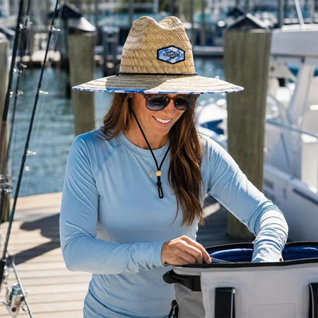
Interior labels and marks serve a different purpose from external decoration. They offer little visibility while the hat is worn, but they can support brand identification during unboxing, retail inspection, sizing, care checks and handling.
Interior placement must be checked for comfort as well as appearance. Label position, material, folded or cut edge, stiffness, thickness and interaction with the sweatband or internal seams can affect how the finished hat feels.
An open-access textile–skin friction study supports the general point that moisture and relative movement can affect friction and comfort mechanisms. It does not predict the performance of a particular hat or label.
Buyer action: When reviewing an interior label, check more than print clarity. Assess its position, material, edge finish, attachment and wearing comfort on the finished physical sample under the intended use conditions. Use an agreed project-specific wear review rather than assuming one universal test duration.
The Four-Part Feasibility Test
1. View
Examine the hat from the angles in which it will actually be seen: front, profile, rear, above, below and on-head during movement. This reveals whether the mark delivers the intended level of recognition.
2. Compatible Zone
Identify the portion of the visible area that is compatible with the artwork and method. Check curvature, taper, seams, trim, surface texture, material transitions, flexible layers and nearby structural features.
For adhesive-backed constructions, surface roughness, contact and joint geometry may affect bonding. 3M’s overview of surface roughness and adhesion explains the general mechanism; it does not validate a particular adhesive, patch or straw hat.
3. Equipment Access and Stability
Confirm that the chosen area can be reached and held securely by the equipment required for the selected method.
Brother’s cap-frame instructions discuss support, tension and clearance around machine parts. The STAHLS’ cap-press manual describes conforming a cap face to a platen and adjusting pressure for the material thickness. These equipment-specific sources show why a visible area may not be a stable, reachable production area; they do not identify equipment owned or used by TerraHats.
4. Finished Wear
Review the decorated physical sample as a worn product. Confirm that the artwork appears balanced on the three-dimensional form, the decoration does not create an unacceptable change in shape or flexibility, interior components remain comfortable, and the logo is visible in the intended situation.
A technically completed decoration is not necessarily a commercially successful result. The final hat must work as both a branded object and a wearable product.
Straw Hat Logo Placement Decision Table
| Placement zone | Typical viewing direction | Potential branding role | Main feasibility questions | Alternative route to review |
|---|---|---|---|---|
| Front crown | Usually strongest in a direct front view | Primary logo or main identifier | How do crown curve, taper, seams and internal structure affect the artwork and process? | Reduce width, simplify the mark or move it within one stable crown zone. |
| Side crown | Profile and movement | Secondary logo, signature or small identifier | Is the side clear of trim, and can the curved area be stabilized? | Reduce scale or compare a band or interior brand touchpoint. |
| Back crown | Rear-facing and style-dependent | Discreet mark or secondary identifier | Do seams, adjustment features, trim or crown shape reduce the usable zone? | Compare a smaller mark, side crown, hat band or interior label. |
| Hat band | Horizontal and visually distinct | Repeated motif, small mark or branded component | Is the band fixed or separate, and when must decoration occur? | Review a separate branded component or another compatible crown zone. |
| Upper brim | Angle-dependent; often clearer from above | Secondary graphic or accent | Is the surface sufficiently stable and compatible with the method? | Review a smaller compatible mark, brim-edge binding or another verified component. |
| Brim edge | Narrow accent around the silhouette | Color cue or repeating detail | Does the selected style support the specified printed or solid binding? | Use a simpler color or repeat direction if detailed artwork is unsuitable. |
| Under-brim | Revealed during tilt, movement or low-angle views | Secondary reveal or campaign graphic | Can artwork direction, crop, seams, material stack and edge treatment be approved together? | Simplify the artwork, increase safe margins or coordinate it with an exterior identifier. |
| Interior | Minimal external visibility | Private label, size, care or owner information | Does the label integrate with the interior construction and remain comfortable? | Adjust position, material, edge finish or label construction on the sample. |
What Buyers Should Include in a Placement Specification
Provide:
- The selected hat style or reference sample
- The intended placement zone and viewing direction
- Current logo artwork and version
- Intended finished dimensions, where known
- The preferred decoration method, if already chosen
- The logo’s role: primary, secondary, reveal or interior information
- Color references
- Whether a band, binding, label or patch is part of the concept
- Reference photographs or sketches showing proportion and position
- Any retail, campaign, staff or uniform context that affects visibility
- A request for a placement mockup
- A requirement to review the selected physical sample before final approval
Avoid transferring one fixed logo size or offset across different styles before each hat and method has been assessed. A location that works on one crown or brim may not transfer cleanly to another.
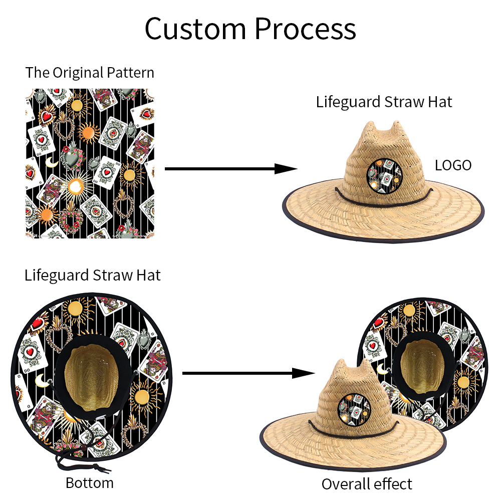
Image 4 translates that review into a visual markup: the green frame identifies a candidate workable zone, the red dashed area flags curvature or construction risk, and the grid shows how a flat mark may change across the crown. These overlays organize the discussion; they are not production measurements.
A Mockup Is a Decision Tool, Not Final Feasibility Approval
A placement mockup helps compare scale, orientation, viewing angle and visual balance. It can support a decision to keep the logo on the front crown, move it toward the side, place it on a separate band or use it as a secondary detail elsewhere.
But a mockup may not fully represent crown curvature, straw texture, seams, internal layers, equipment access, production stabilization, brim movement, material response, attachment or interior comfort.
Mockup approval and feasibility approval should therefore remain separate stages. The selected physical sample is where visibility, production access and finished wear can be reviewed together.
Frequently Asked Questions
What is the best logo placement on a straw hat?
There is no universal best placement. The front crown often provides the most direct view, while side, band, brim, under-brim and interior positions serve different branding goals. The right choice depends on the target visibility, hat construction, artwork and decoration method.
Is the largest visible area also the largest printable or embroiderable area?
Not necessarily. Seams, curvature, taper, texture, material layers and equipment access can make the workable decoration zone smaller than the area visible to the eye.
Can the same logo placement be used across multiple hat styles?
It should not be assumed. A position that works on one crown or brim may behave differently on another silhouette. Each selected style needs its own placement and feasibility review.
Does using a patch solve difficult surface or texture issues?
Not automatically. A patch provides a separate carrier for the artwork, but its size, shape, backing, edge profile, attachment and relationship with the hat still need evaluation.
Is a digital mockup enough to approve production?
No. A mockup helps confirm visual intent, but it cannot confirm every constraint involving material response, equipment access, stabilization, finished appearance or comfort. Final review still requires the selected physical sample.
Can a logo go on the hat band or brim edge?
Possibly, depending on the product and construction. Band decoration must be checked against the selected band and production sequence. For TerraHats, brim-edge discussions should be limited to the listed printed or solid-color binding direction rather than assuming unrestricted logo application.
Should interior labels be reviewed for comfort?
Yes. An interior component may have little external visibility but can sit close to the wearer. Its position and finish should be assessed on the physical sample.
Request a Placement Mockup
Use a two-stage review to move from visual direction to a production-representative result.
Step 1 — Review the Placement Direction
Send the selected hat style, current artwork, intended logo role and target viewing angle. TerraHats can review the proposed zone and prepare the applicable placement-mockup direction for comparing scale, orientation and visual balance.
Explore custom straw hats with logo and customization options, then request a placement review.
Step 2 — Confirm the Physical Result
After choosing the visual direction, review the decoration, attachment, three-dimensional balance and wearing comfort on the selected physical sample. Record the approved artwork version, dimensions, location and construction reference before bulk production.
For related feasibility decisions, compare Why Logo Method Changes the Result on Straw Hats and Why Straw Weave Limits Fine Logo Detail.
This sequence gives the mockup a clear job—visual planning—and the physical sample a separate job: confirming how the selected placement works on the actual product.
Sources and Further Reading