-
WhatsApp +86 15116118247
-
Any Questions info@terrahats.com

Why Exact Color Matching Is Hard on Natural Straw
Learn why substrate color, fiber variation, texture, print method and lighting make exact color matching difficult on natural straw.

A color code can define a target, but it cannot make every material reproduce that color identically. On a natural straw hat, the starting tone of the straw, strand-to-strand variation, weave texture, decoration method and viewing light all influence the finished appearance.
For buyers, this does not mean color control is impossible. It means the approval process must be built around the real material. A Pantone reference can communicate the intended direction, while a physical sample on the selected straw construction shows what that direction looks like in practice. The production standard should then define an acceptable range instead of promising that every fiber, component and reorder will look identical under every light.
Table of Contents
Quick Answer: Why Is Exact Color Matching Hard on Natural Straw?
Natural straw is not a perfectly uniform canvas. Its base tone and surface character can vary, while ridges, overlaps, gaps and strand direction change the way light reaches the eye. Effective custom hat color matching therefore uses a physical, material-specific approval range under agreed conditions—not a screen image or color code alone. Hat-body color, direct decoration and attached-component color are separate matching tasks and should be approved for their own substrates and processes.
A Pantone Reference Is the Starting Point, Not the Finished Appearance
In a custom hat project, a brand color may pass through several representations:
- A digital artwork file
- A Pantone or other recognized color reference
- Ink, thread, fabric, binding, patch or transfer material
- A physical material or component sample
- A finished hat sample
- Bulk production viewed in its retail or use environment
These representations can share one color direction without looking identical.
A phone or monitor is particularly weak as the sole approval standard. Display brightness, calibration, technology, viewing angle and ambient light can all affect what the buyer sees. A physical guide is more controlled, but it still presents color on the guide’s own substrate and through a defined production system. Pantone’s own coated and uncoated references illustrate that substrate and surface conditions affect appearance.
The safest instruction is therefore not simply “match the color on my screen.” It is: use the stated color reference to develop the target, then approve the result on the selected material and decoration process.
1. The Straw’s Base Tone Influences the Result
Color is seen as light reflected by the complete surface, not as an isolated code. Natural-looking hat bodies may begin with warm cream, yellow, tan or brown undertones. If an applied color is not fully opaque, or if the weave leaves the substrate visible around it, the base tone can shift the overall impression.
A pale blue may appear slightly duller over a warm substrate than it does on white coated paper. A light neutral may look darker or more yellow. Even when coverage is more opaque, the surrounding straw remains part of the visual field and can change the perceived contrast.
Greater coverage is not a universal solution. A thicker layer or different application may affect texture, flexibility, edge definition or surface finish. Buyers should review color, coverage and construction together on the selected material rather than treating them as separate decisions.
The phrase “natural straw” is also too broad to define a color result. Material names can refer to different plant sources, processed braids, mixed constructions or visual styles. One approved straw sample should not automatically be treated as the standard for every other straw construction.
2. Fiber Variation and Weave Texture Change What the Eye Sees
A smooth manufactured sheet provides a more even visual field than a woven natural surface. Straw strands may differ in tone, width, texture and orientation. The weave can add raised areas, recesses, overlaps, visible joins and openings.
These features change the appearance even when the color application is reasonably controlled:
- Raised strands catch highlights.
- Recessed areas and weave shadows look darker.
- Open sections reveal more of the underlying material.
- Directional strands reflect light differently as the hat or viewer moves.
- Local variation can make one small measurement area unrepresentative of the complete hat.
This is why a color reading or close-up photo must be interpreted in context. Industry measurement guidance recommends controlling sample presentation, backing, aperture and instrument geometry. For textured or non-uniform materials, repeated readings with repositioning or rotation can be more representative than a single spot reading. The exact protocol, however, must be defined for the product; there is no universal number of readings for every straw hat.
Natural variation is not an excuse for uncontrolled production. Buyers should distinguish among expected material character, controlled process variation, an approved deviation, a material change and a nonconforming result.
3. The Decoration Method Changes the Color Appearance
“Match this color” is incomplete unless the brief also identifies where and how the color will be used.
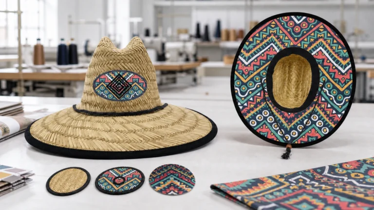
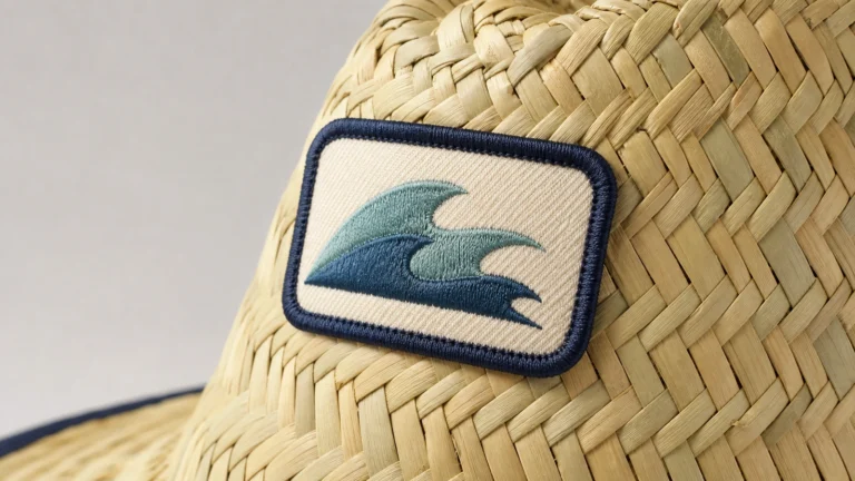
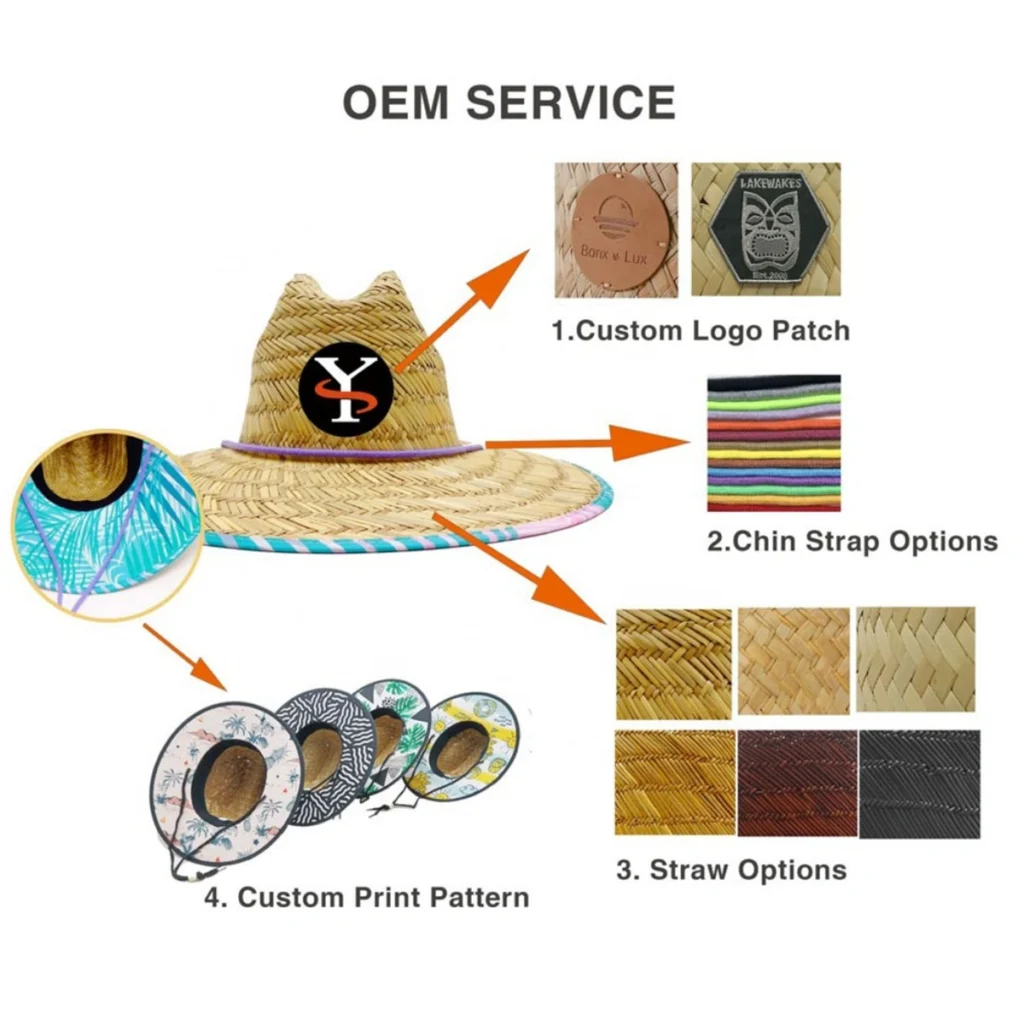
Screen print, heat transfer, embroidery, woven fabric, binding, molded patches and other decoration routes use different materials and surface structures. They can differ in opacity, texture, gloss and directional reflection. Thread may look darker from one angle because its direction changes reflected light. Matte fabric can appear softer than a glossier printed area. A patch can create a controlled branding surface while still rendering the target differently from an adjacent hat band.
Cross-component color coordination is achievable, but cross-component identity should not be assumed. A straw body, under-brim fabric, patch, chin cord, label and packaging insert can all follow the same brand palette while remaining visibly different materials.
For multi-component programs, specify which component controls the color decision and whether the others must be:
- Visually coordinated to it
- Measured within an agreed, method-specific tolerance
- Approved separately as substrate-specific interpretations
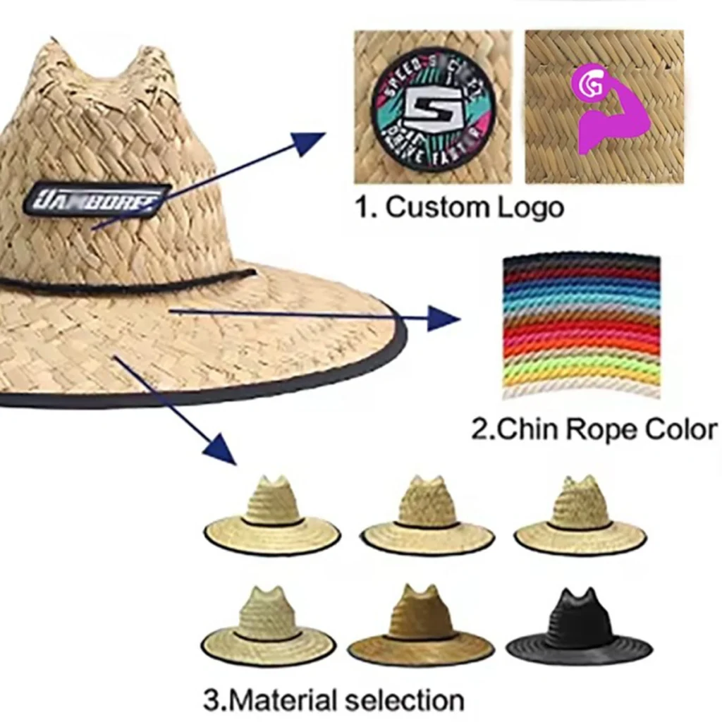
This prevents a late dispute caused by comparing unlike materials as though they were the same surface. When choosing between direct printing and a custom patch, consider how straw weave density limits fine logo detail: the surface can affect color coverage and edge definition at the same time. Color feasibility and detail feasibility are related, but they remain separate approval decisions. Buyers can review the available materials, colors and decoration methods before defining the sample scope.
4. The Same Pair of Colors Can Separate Under Another Light
A sample that looks acceptable beside a window may look different under warm retail lighting, cool office lighting or outdoor daylight. The product has not necessarily changed. The light reaching it has.
CIE colorimetry defines color evaluation through stated conditions, including a standard illuminant and observer. D65 is a standardized representation of average daylight; it is not a promise that every real daylight environment has the same spectral composition.
Metamerism is another reason to check relevant lighting. Two samples can match within a specified colorimetric system while having different spectral distributions. As the light changes, their visual relationship may change. This matters when a hat combines straw, ink, fabric and thread that reach a similar target through different colorants and materials.
Color-critical approvals should record the agreed viewing or measurement conditions. They should not compare one sample under warm indoor light with another under daylight, or compare a reflective physical sample directly with a glowing screen.
Turn the Lighting Requirement Into an Approval Procedure
For critical visual appraisal, use a maintained standard color-viewing cabinet rather than a desk lamp or changing window light. ASTM D1729 recommends simulated D65 average daylight for visual appraisal of diffusely illuminated opaque materials. Because a straw hat may also be sold under retail or venue lighting, buyer and supplier can add a second agreed light source that represents the intended environment—such as TL84/840-type retail lighting, CWF or another program-specific source.
The important control is not the equipment brand. Both sides should use compatible viewing conditions, identify the selected light sources in the approval record, allow the lamps or LEDs to operate according to the equipment instructions, keep the viewing area neutral and compare the standard and sample in the same orientation. Open or highly directional straw constructions may fall outside the assumptions of an opaque, diffusely illuminated sample, so the viewing method must be validated for the selected hat rather than adopted mechanically.
Which Color Reference Should Control Approval?
| Approval reference | What it can establish | What it cannot prove | Best use |
|---|---|---|---|
| Phone or monitor image | General creative direction | A stable physical color appearance | Early discussion only |
| Current physical Pantone or other recognized guide | Shared color intent | Identical appearance on straw, fabric, thread or plastic | Starting specification |
| Existing branded item | Brand context and approximate appearance | Transferability across a different substrate, age or process | Supporting reference |
| Sample on the intended straw or component | Appearance on the relevant material and process | Complete-hat geometry or the full natural range | Pre-sample evaluation |
| Approved finished hat sample | Combined effect of material, construction and decoration | That every natural detail in bulk will be identical | Primary bulk reference |
| Approved physical boundary samples | Acceptable light/dark and texture boundaries | Every future material lot or lighting environment | Primary natural-variation boundary |
| Controlled-light photographs of approved samples | Sample identity, position and an approximate record of visible differences | A standalone color acceptance standard | Supporting documentation only |
| Retained bulk unit | Historical result from a prior order | That an aged reference and new material lot will match automatically | Reorder comparison with reconfirmation |
No single reference answers every question. A color code defines intent. A substrate-specific physical sample defines the approved appearance. The written inspection method and agreed tolerance define how production will be evaluated.
Where Variation Appears in a Real Order
Sample to bulk
The sample stage should confirm whether the target works on the selected straw, weave, finish and decoration method. Bulk review should compare production with that approved reference under consistent conditions. The question is not whether every fiber is identical; it is whether the order remains within the accepted direction and whether controlled elements meet the agreed requirements.
Piece to piece
One finished hat cannot show every reasonable natural variation. If the appearance range matters, approve representative physical samples or clearly documented physical boundary examples. Controlled-light photographs can record those references, but they should not independently define the acceptable color boundary unless the parties have agreed on a complete color-managed imaging protocol. Averages should not hide obvious local streaks, patches or uncontrolled application problems.
First order to reorder
A reorder should reference the previous approved sample or retained bulk unit, but it should not assume automatic visual identity. The current material lot and application still need review when color is commercially sensitive. Stored samples can also change through age, light exposure, handling and storage, so record the reference date and condition.
There Is No Universal ΔE Limit for Natural Straw Hats
ΔE expresses a calculated color difference, but the number is meaningful only when the color-difference formula and measurement conditions are defined. Different formulas do not produce interchangeable values, and texture, gloss, sample direction and measurement geometry can affect how well a numerical difference corresponds to visual acceptance.
ASTM D2244 states that commercial tolerances should be agreed by buyer and seller for the relevant material and use. ASTM D3134 provides a method for establishing tolerances but does not prescribe one universal tolerance size. ISO 105-J03 calculates differences between specimens of the same material measured under the same conditions; it should not be used to imply that a paper guide, fabric swatch and woven straw automatically share one threshold.
These standards can help design a color-control protocol, but they do not prove that every finished straw hat is directly measurable in the same way. Open, translucent or strongly textured weaves may require validation of opacity, backing, aperture, geometry and sample presentation before instrumental results are treated as representative.
If the Buyer Requires Numerical ΔE Tracking
A strict customer SOP can still use numerical color data without forcing one reading method onto the entire hat. First identify a suitable component control area: for example, an opaque, reasonably uniform printed patch, fabric under-brim or other component produced with the intended material and process. If that area can be measured repeatably, buyer and supplier can agree on the instrument geometry, aperture, backing, illuminant, observer, color-difference formula and tolerance for that component.
Use approved physical light-limit, target-master and dark-limit samples for a natural woven straw body when its openings, directionality or local texture make spot measurements unrepresentative. This hybrid protocol gives the quality team numerical tracking where the substrate supports it and a controlled visual boundary where it does not. It does not allow a component reading to certify the color of the complete straw body, and it should not name a specific spectrophotometer model unless both sides have verified instrument compatibility and inter-instrument agreement.
If an instrumental tolerance is needed, define the formula, illuminant, observer, geometry, aperture, sample presentation, number and location of readings, and acceptance rule. Then correlate the numbers with samples the buyer actually considers visually acceptable. Do not borrow an unexplained ΔE limit from another substrate or supplier.
Buyer Checklist Before Color Approval
- Identify the intended color reference and its version or date.
- Treat screen colors as direction, not the physical approval standard.
- Confirm the selected straw material, weave and finish.
- Review the target on the intended material and decoration method.
- Identify the component that controls the color decision.
- Decide whether other components require coordination or separate approval.
- Record the relevant viewing or measurement conditions.
- Define an acceptable natural color and texture range.
- Separate natural variation from uncontrolled production variation.
- Identify the finished sample used for bulk approval.
- Record approved boundary samples, photos and decision dates.
- Require review if the material, process, finish or component changes.
- Reconfirm color-critical reorders against current material.
For the broader approval sequence, see the TerraHats sample policy.
Before sampling, buyers should also prepare usable artwork and color references. Projects with printed liners can review why printed under-brims need sample approval on the selected fabric and finished hat.
Frequently Asked Questions
Can a Pantone code guarantee an exact match on natural straw?
No. It gives the buyer and supplier a shared color target, but the final appearance also depends on the straw, weave, decoration method, opacity, surface finish and viewing light. Approve the result on the intended material.
Why does the same brand color look different on straw and a fabric band?
The components have different base tones, textures and reflective properties, and they may use different coloring processes. They can be coordinated without looking physically identical.
Is a digital mockup enough for color approval?
No. A mockup is useful for placement, scale and general direction. It cannot reproduce the physical substrate, surface relief or the buyer’s exact viewing environment.
Does visible variation mean the bulk order is defective?
Not necessarily. The result should be judged against the approved material direction, acceptable range and workmanship requirements. Natural variation does not automatically make every shade difference acceptable.
Should we set a ΔE tolerance?
Only when the parties also define the formula, instrument and measurement conditions, sample preparation and commercially acceptable range. There is no universal straw-hat ΔE threshold.
How should we manage a color-critical reorder?
Provide the previous approved reference and order information, then review the current material. If a visible difference would affect brand acceptance, approve a current material or finished sample before bulk production.
Build the Color Approval Around the Real Material
Reliable custom hat color matching begins with a clear color target, but it depends on a material-specific approval process. Define the intended color, review it on the selected straw construction, coordinate unlike components realistically and record an acceptable range for bulk production and reorders.
Need More Controlled Color Approval for Your Hat Line?
Do not rely on a screen alone. Share your color reference, selected hat direction, material, decoration method, quantity and target date with the TerraHats team. After feasibility review, the sample plan can identify whether the project should include straw base swatches, physical light/target/dark boundary references and material-specific decoration samples.
Availability, sample scope, charges and timing should be confirmed for the selected project; this article does not imply that a standard preassembled swatch kit is available for every material or order.
Request a Color and Material Sample →
Sources and Further Reading
- CIE: Colorimetry, 4th Edition
- CIE International Lighting Vocabulary: Metameric Colour Stimuli
- CIE: Colorimetric Illuminants
- ASTM International: ASTM D2244-25 — Calculation of Color Tolerances and Color Differences
- ASTM International: ASTM D3134-15(2024) — Establishing Color and Gloss Tolerances
- ASTM International: ASTM E1164-23 — Spectrometric Data for Object-Color Evaluation
- ASTM International: ASTM D1729-22 — Visual Appraisal of Colors and Color Differences
- ISO: ISO 105-J03:2009 — Calculation of Colour Differences
- Datacolor: Best Practices for Measuring Color Samples
- Pantone: What Coated and Uncoated Mean