-
WhatsApp +86 15116118247
-
Any Questions info@terrahats.com
Why Logo Method Changes the Result on Straw Hats
Compare logo methods for straw hats and see why weave, surface, artwork detail and placement change the final result and sample requirements.

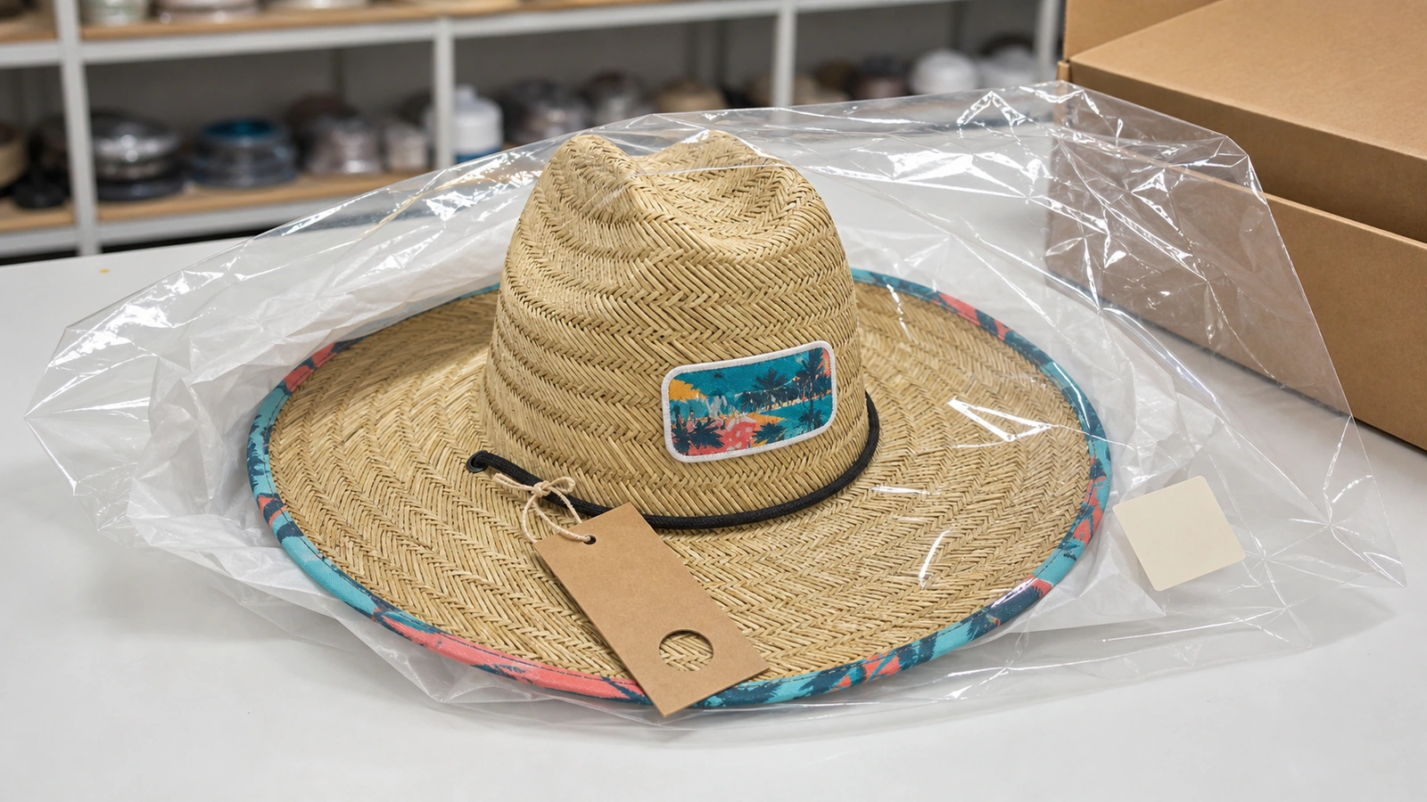
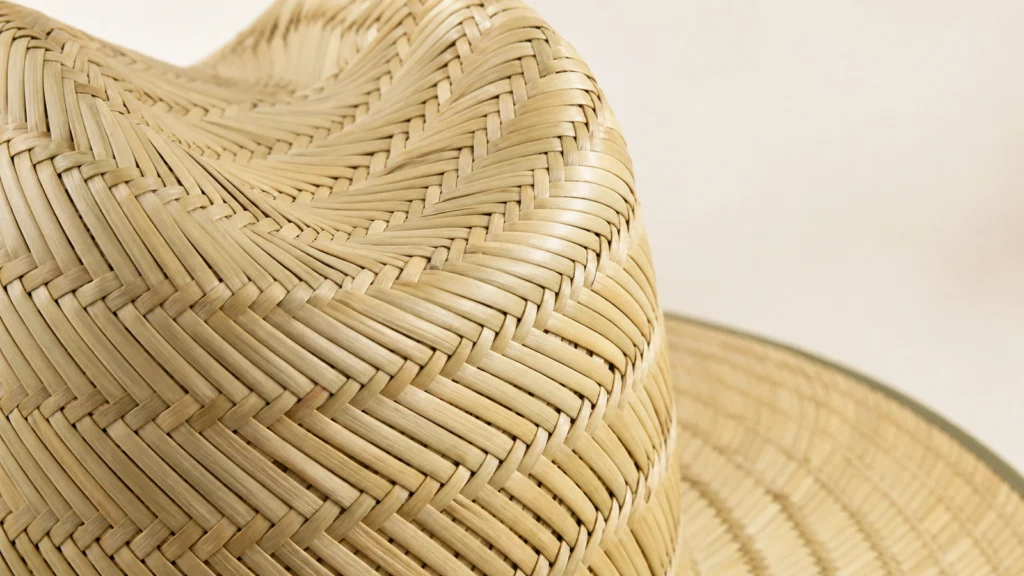
The logo method changes the result because a straw hat is not a flat, uniform decoration surface. Its weave, openings, texture, curves and construction affect how artwork is stitched, printed, transferred or attached.
The same artwork can therefore produce different edges, relief, color behavior and overall brand character depending on the method. Fine details that remain clear on a fabric patch may lose definition when embroidered directly onto coarse straw. A logo that looks balanced in a digital mockup may also appear wider or less centered when placed across a curved crown.
For buyers, the useful question is not simply, “Can this logo go on a straw hat?” It is:
Which method best supports this artwork, hat construction, placement and approval standard?
The answer should be confirmed on the selected product rather than inferred from a reference image or another hat style.
Table of Contents
Start With the Hat Surface
Before comparing straw hat logo methods, review four connected variables:
- Surface: Is the straw relatively continuous, coarse, smooth, irregular or open?
- Construction: Can the intended area be accessed and held by the required equipment?
- Artwork: Does the logo depend on small lettering, narrow gaps, gradients or precise outlines?
- Placement: Will it sit on a curved crown, a band, a separate patch or an under-brim fabric panel?
Coarse or open texture may interrupt fine lines and the enclosed spaces within small letters. Crown curvature can change the apparent width and scale of a logo. Seams, bands and transitions between materials can further reduce the usable decoration area.
The practical response may be to simplify or enlarge the artwork, change its placement, or move it onto a controlled carrier such as a patch. Buyers developing custom straw hats with a logo should therefore treat the hat, logo method and placement as one specification—not three independent approvals.
Material names are only a starting point
“Straw” is a commercial category, not a single decoration substrate. A sourcing brief may describe:
- Paper-based or synthetic braid: May form a comparatively regular surface in some constructions, but braid width, joining, coating and crown stiffness still need confirmation.
- Named plant fibers: Toquilla, wheat and other plant names identify a material direction, not a universal weave density or logo capability.
- Mat- or rush-style bodies: Often selected for a broad, rustic texture; the actual fiber, strand width, gaps and reinforcement should be recorded rather than inferred from appearance.
- Open or hollow weave: Visible openings reduce the continuous area available for direct decoration and patch attachment.
- Mixed weave: Different zones may behave differently, so the specification should map the intended logo position to the relevant material and construction.
A finely constructed paper-based braid may present a more regular decoration area than a coarse rush-style body, but material names alone do not approve direct embroidery or printing. Compare close-up weave images, the bill of materials and a decorated sample for the exact SKU.
How Each Logo Method Changes the Result
Direct embroidery
Direct embroidery creates an integrated, thread-led result without a separate patch border. Its suitability depends on the hat construction, the ability to hold the decoration area, the digitizing approach, the support used and the way stitches interact with the weave.
On open or uneven straw, small details and clean outlines may be harder to reproduce. Buyers seeking this stitched appearance should confirm it through a decoration trial or physical sample on the selected construction.
Woven patch
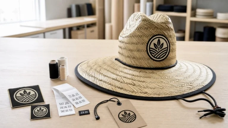
A woven patch forms the artwork on a controlled textile surface before attachment to the hat. Compared with a visibly stitched embroidered patch, it can often reproduce finer lines and smaller lettering more clearly.
The final result still depends on patch size, color separation, edge treatment and attachment. Intricate artwork is not automatically feasible simply because a woven patch is used.
Embroidered patch
An embroidered patch emphasizes raised thread, stitch direction and tactile texture. It can create a more dimensional, traditional impression, but fine artwork may need simplification because stitches—not a flat printed image—define the result.
Choose between woven and embroidered patches according to the intended visual character. Woven patches may suit a flatter, detail-led result; embroidered patches may suit a more pronounced thread-led appearance.
Leather-look patch
A leather-look patch can support a restrained, heritage or outdoor direction. However, “leather-look” describes an appearance; it does not confirm genuine leather.
The specification should state the actual material, finish, color, marking method, edge treatment and attachment. Patch tone should also be reviewed against the natural straw color on a physical sample rather than judged only from a screen rendering.
Rubber and PU patches
Rubber and PU patches can create molded, raised or sporty effects. The terms should not be treated as interchangeable without supplier confirmation.
Relief depth, line spacing, thickness, color separation, edge shape and attachment all affect legibility and proportion. A patch that looks balanced in a digital rendering may feel visually heavy on a lightweight woven body, so physical scale review matters.
Printed patch
A printed patch may suit multicolor artwork, tonal effects or gradients that are difficult to express through thread or molded color areas.
Buyers still need to approve the base fabric, print method, background treatment, edge and attachment. The carrier shape becomes part of the design, even when the original artwork has no border.
Heat transfer and screen print
Heat transfer depends on the relationship among time, temperature, pressure and the actual substrate. Settings used for one fabric or hat should not be assumed suitable for another.
Direct heat application to a natural, paper-based or mixed straw body is a high-review route. Curvature, seams, gaps and surface variation can prevent even pressure or full adhesive contact, while an unsuitable temperature can discolor, deform or melt a heat-sensitive component. Test the actual blank before approving adhesion or appearance.
Screen printing generally requires a sufficiently continuous, accessible application area. Across open or irregular straw, gaps and uneven stencil-to-surface contact may produce broken coverage or uncontrolled edges.
When the straw body does not provide a stable, continuous area, evaluate a compatible hat band, fabric patch or under-brim liner instead. This is a safer development direction—not proof that every band, patch or liner accepts every transfer or ink system.
For either route, a sample should confirm color, registration, edge definition and interaction with the substrate.
Printed under-brim
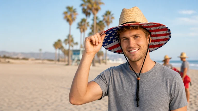
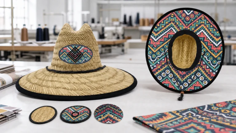
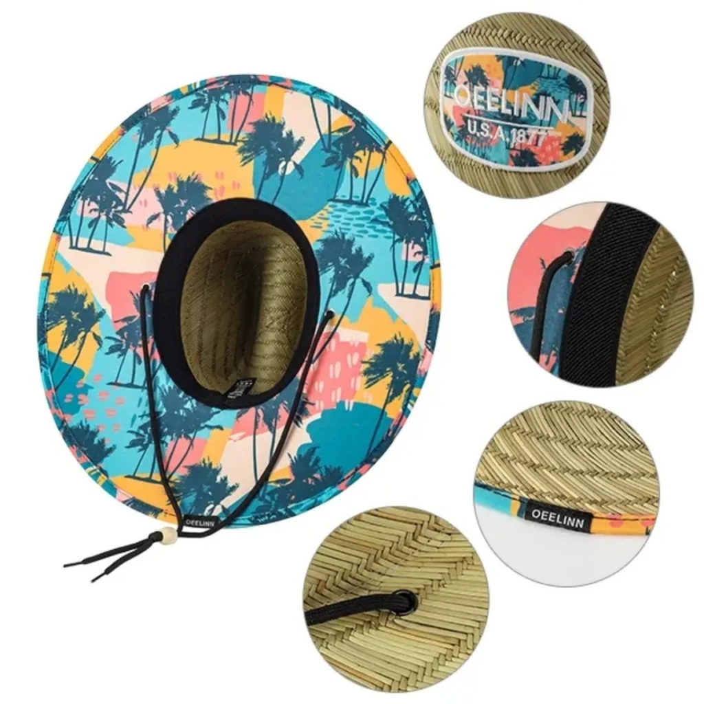
A printed under-brim is usually a construction decision rather than direct printing onto straw. The artwork is commonly applied to a compatible fabric or liner incorporated into the brim assembly.
Review the visible boundary, repeat, orientation, alignment, edge binding and areas where artwork may be cut or concealed. Color should be assessed on the actual material. Buyers can compare relevant customization options and custom lifeguard straw hat constructions before defining the sample.
Straw Hat Logo Method Decision Table
| Buyer priority or artwork condition | Method to evaluate | Main approval focus |
|---|---|---|
| Integrated stitched appearance | Direct embroidery on a compatible construction | Weave interaction, distortion, stitch definition and backing |
| Fine lines or relatively small text | Woven patch | Readability, dimensions, border and attachment |
| Raised, thread-led texture | Embroidered patch | Stitch coverage, simplified detail, relief and edge finish |
| Heritage or understated direction | Leather-look patch | Actual material, marking, tone, thickness and edge |
| Molded or sporty appearance | Rubber or PU patch | Material identity, relief, spacing, scale and attachment |
| Multicolor or gradient artwork | Printed patch | Print clarity, base fabric, border and color |
| Flat graphic on a compatible area | Heat transfer or screen print | Substrate compatibility, pressure or access, registration and edges |
| Large secondary visual beneath the brim | Printed fabric or liner | Repeat, orientation, trim boundary, binding and color |
Use the table to identify methods worth sampling—not as an automatic selection rule. The exact style, material, construction and artwork must still be reviewed together.
Use dimensions as screening triggers, not universal limits
Quantitative references can improve an RFQ, but they must stay tied to a process. For example, one STAHLS’ specification lists a minimum character height of 4 mm for its embroidered patches, while its woven-patch sheet lists 2 mm-high text and 0.2 mm-wide elements. Madeira’s embroidery guidance shows that achievable lettering changes with thread weight: its stated examples range from 6–7 mm for standard 40-weight thread to 3 mm for 60-weight thread under the described setup.
These are supplier- and process-specific figures—not straw-hat acceptance limits. As a practical screening rule, flag text approaching 5 mm, narrow strokes, tight counters and small gaps before sampling. Ask the factory to return the proposed method, finished logo dimensions, thread or patch specification, and any recommended artwork simplification. The decorated sample remains the approval reference.
Not sure which method fits your artwork?
Request a logo and artwork feasibility review with the selected hat style, vector file or clear artwork, intended dimensions and placement. The review can identify the methods and details that should enter sampling; availability and commercial terms are confirmed for the project.
Attachment Is a Separate Decision
Selecting a patch material does not complete the specification. The attachment method can change both appearance and performance.
Stitching, adhesive-supported routes and other production methods interact differently with roughness, curvature, patch thickness and available contact area. A patch that looks correct before attachment may ripple, lift, distort the crown or show an unsuitable stitch line afterward.
Ask the supplier to document:
- The proposed attachment method
- Whether the patch attaches to straw, a band or another carrier
- The visible stitch line or edge treatment
- Any backing or support
- How curvature and open areas affect contact
- What the physical sample will be used to approve
No attachment method should be assumed suitable for every straw construction.
Digital Mockup vs. Physical Sample
A digital mockup helps approve direction: artwork version, approximate scale, placement and broad color relationships. It does not fully confirm:
- Straw texture or openings
- Stitch penetration and thread relief
- Print interaction with the substrate
- Patch thickness and edge behavior
- Attachment on a curved surface
- Finished color under real viewing conditions
- The balance of the logo on a three-dimensional hat
A physical sample shows how the selected method works with the actual construction. Review it alongside the current specification and artwork version.
The sample is a defined approval reference, not a promise that every bulk unit will look visually identical, particularly when natural materials are involved. The TerraHats sample policy can help buyers establish the appropriate review stage.
Checklist Before Authorizing a Logo Sample
Hat and placement
- Exact hat style and material identified
- Straw surface reviewed at the intended location
- Crown curve, band, seams and brim boundaries considered
- Logo position defined from clear reference points
Artwork and method
- Current artwork file and version identified
- Finished logo dimensions stated
- Small text, narrow gaps and gradients flagged
- Method confirmed for the selected construction
- Patch material and logo technique specified separately
- Edge treatment, backing and attachment documented
- Under-brim repeat and orientation defined where applicable
Approval evidence
- Mockup identified as a visual planning reference
- Physical sample or decoration-test scope agreed
- Actual colors and materials reviewed
- Revisions recorded by version
- Buyer and supplier agree on what the sample approves
- Any method, material or placement change triggers renewed review
Sample scope, quantity, cost and schedule may also change with the selected method and should be confirmed for each project.
Choose the Method by the Result You Need
Logo selection for straw hats is a product-development decision, not a final artwork-upload step. The surface influences what the hat can support. The artwork defines the detail that must remain legible. Placement changes how the logo is viewed, while attachment determines how the decoration becomes part of the hat.
For private-label and wholesale programs, record these decisions in the product specification. Buyers building a coordinated range can also review private-label straw hats and broader wholesale hat options.
Request a logo-method review.
Send TerraHats the selected hat style, artwork file, intended logo dimensions, placement and visual direction. The team can identify which methods should be evaluated on that construction.
Sources and Further Reading
- Melco — Cap Embroidery with Melco Embroidery Machines
- Ricoma — How to Embroider Straw Hats
- STAHLS’ — Woven Patches
- STAHLS’ — Woven Patches Specification Sheet
- STAHLS’ — Embroidered Patches Specification Sheet
- Madeira USA — Embroidering with 60 Weight Thread
- Siser — Getting Started with Heat Transfer Vinyl
- Siser — DIY Floppy Sun Hat
- Transfer Express — MAXX Cap Heat Press
- Pantone — Why Physical Color Samples Matter
- 3M — Influence of Surface Roughness on Adhesion