-
WhatsApp +86 15116118247
-
Any Questions info@terrahats.com
Why Straw Weave Limits Fine Logo Detail
Learn why open or irregular straw weave can reduce fine logo clarity and when a patch or alternate placement may be a safer option.

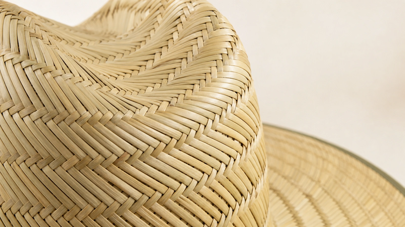
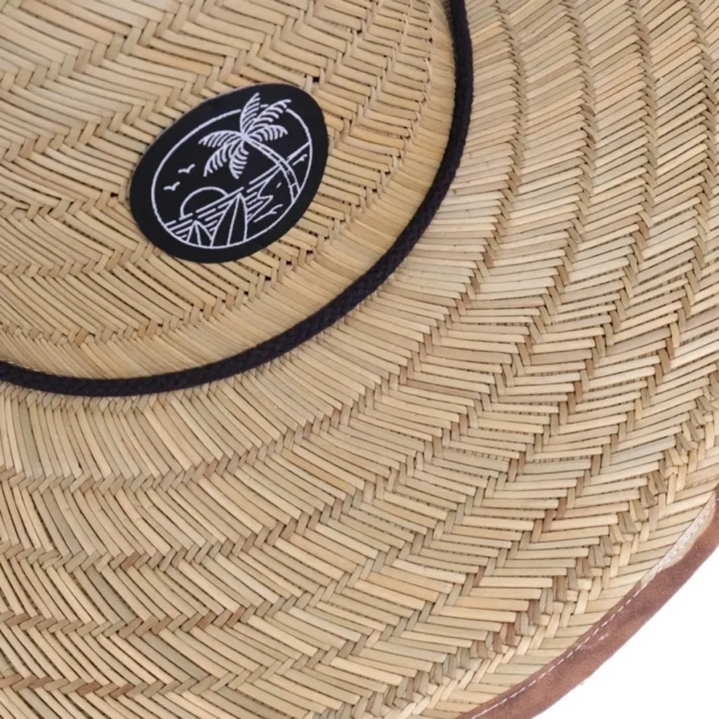
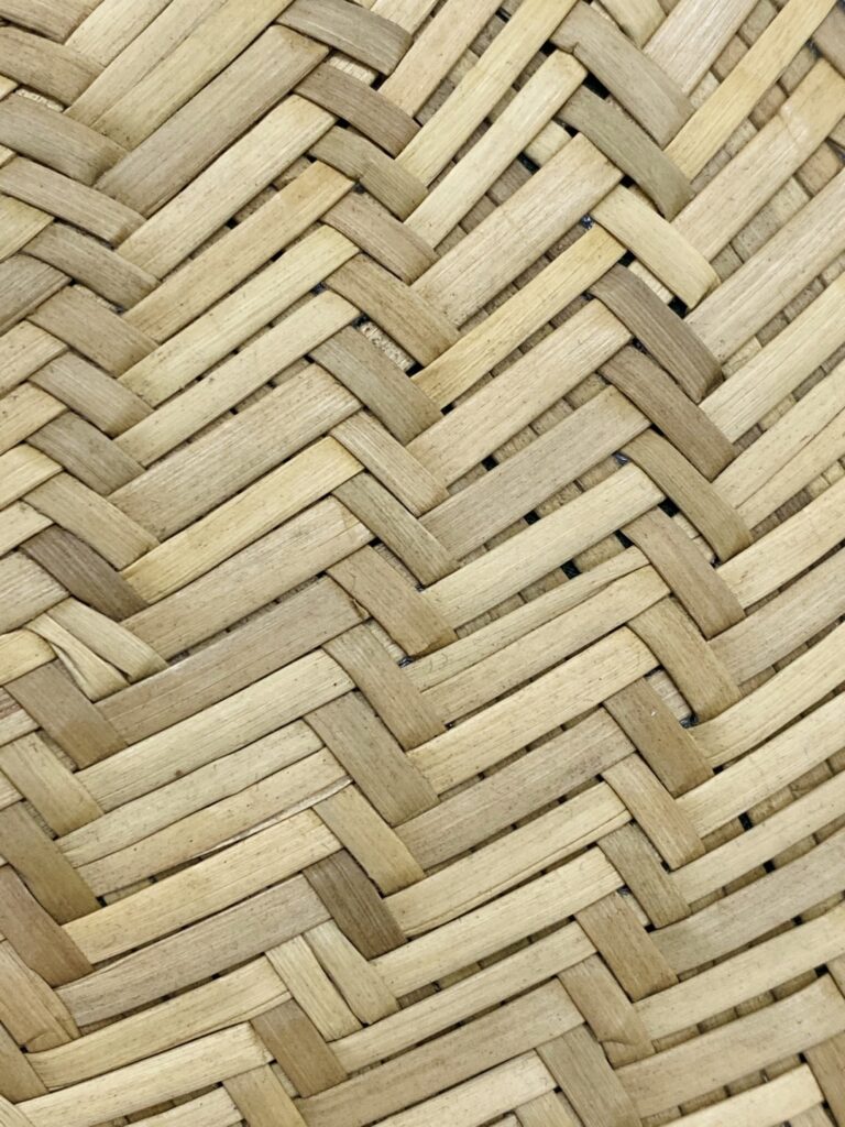
When a logo is applied to a woven straw hat, it must cross strands, gaps, ridges and changes in height—often on a curved crown. These features can interrupt a narrow stroke, close the counter inside a small letter or make a clean vector edge appear uneven.
The issue is not whether straw can be branded. It is whether the selected weave, decoration process, artwork scale and attachment route can preserve the features that make this particular logo recognizable.
For buyers, the decision follows a clear chain: surface continuity affects process control; process control affects edge definition; a separate carrier may improve the artwork surface but adds backing and attachment variables; and scale or simplification determines which details survive. The result must then be checked on a production-representative physical sample.
Table of Contents
Straw Weave Is Part of the Artwork Specification
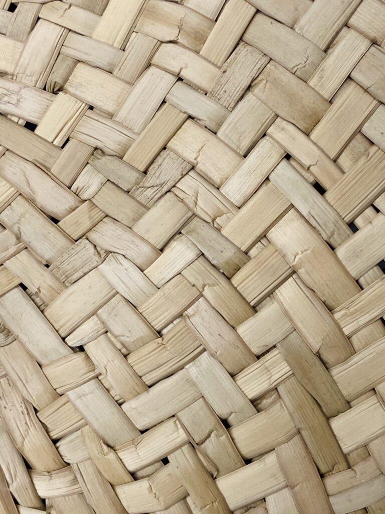
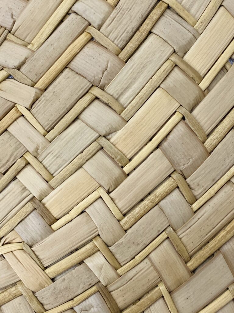
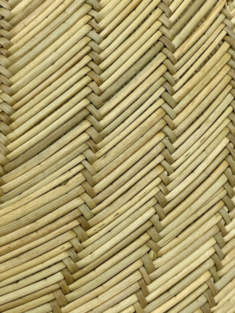
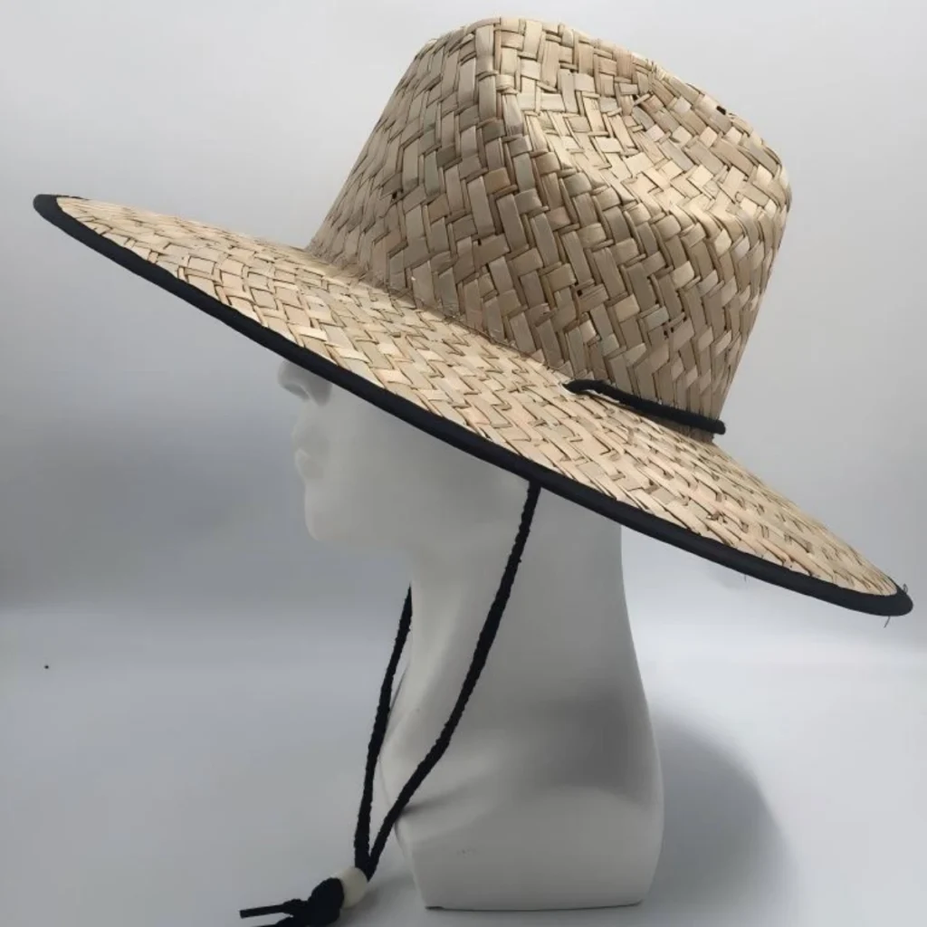
“Straw” does not describe one uniform surface. Commercial straw hats can include natural fibers, paper-based materials, synthetic braids or mixed constructions. The body may be tightly braided, broadly matted, visibly open, hollow, irregular or reinforced only in selected areas.
Even two hats with a similar natural appearance can present different decoration conditions.
A useful surface review should consider:
- How continuous the intended logo area is
- Whether the strand spacing is tight, irregular or visibly open
- How much the strand height changes across the area
- Whether the surface flexes when handled
- Whether the crown curve changes within the logo footprint
- Whether seams, bands or material transitions cross the placement
- Whether the inside can accept backing or attachment stitches
- Whether the selected area can be held consistently during production
Research on wheat and barley straw aggregates documents differences among straw types and internal structures, but it does not establish decoration limits for a finished hat. The woven body, joining method, shaping, coating and reinforcement all affect the actual result, so the production hat remains the relevant test substrate.
Continuity matters before smoothness
A straw crown does not have to look smooth to support an effective logo. However, it needs enough usable continuity for the selected process.
A tightly constructed but textured area may offer many neighboring contact points. An open weave may leave parts of a fine line crossing empty space. A mixed weave may appear suitable at one point and become less stable only a short distance away. On a curved crown, the top and bottom of the same logo may also sit at different angles.
This makes placement-specific inspection more useful than a general statement such as “this straw is suitable for embroidery.”
Ask for a close-up of the exact decoration zone or mark the proposed logo footprint on a sample image. If a collection uses more than one hat construction, do not automatically transfer approval from one SKU to the others.
Surface Stability Controls Stitch Placement
Direct embroidery converts artwork into stitches. Those stitches need to enter, hold and turn in controlled positions while the decoration area is supported by the machine setup.
A woven straw crown can challenge that control in several ways:
- A needle may meet a strand at one point and a gap at another.
- Adjacent strands may respond differently to repeated penetration.
- A flexible crown may move while the design is running.
- A raised strand can change how a short stitch sits or appears.
- A curved or hard-to-hoop placement may be difficult to stabilize evenly.
- Dense stitching can concentrate force in an area that was not designed as a flat textile panel.
Cap-embroidery guidance from Melco emphasizes stabilization, backing, hooping and sewing sequence because movement and structure affect the finished design. These principles are relevant to straw hats, but the correct setup still depends on the actual crown construction.
A stable path does not mean the material becomes flat. It means the digitized design, support and machine setup work together well enough to place stitches predictably.
More stitches do not automatically produce more detail
When a thin line appears weak in a mockup or early test, increasing stitch density may sound like the obvious correction. It is not a universal solution.
Density describes how closely stitches are placed. If it is too low for the design and substrate, the base may show through or an edge may lack coverage. If it is too high for the material, the embroidery can become rigid, crowded or distorted. Extra stitches can also pull neighboring areas together rather than opening a small gap.
Madeira’s guide shows that stitch density and needle size vary with thread weight, while Wilcom explains that fabric-specific settings adjust density, pull compensation, coverage and underlay. These settings should not be copied from an unrelated cap program and assumed suitable for straw.
For a buyer, the important approval points are visible rather than purely numerical:
- Does the line remain separate?
- Does the letter stay recognizable?
- Are enclosed spaces still open?
- Is the outline smooth enough for the intended viewing distance?
- Does the crown remain acceptably shaped?
- Does the sample provide an acceptable reference for bulk production?
The practical screening limit is the smallest feature that remains open and legible on a production-representative sample of the selected construction. It is a project-specific approval point, not a universal millimeter rule or a guarantee of identical bulk appearance.
Edge Definition Is Where Detail Loss Becomes Visible
Buyers usually notice a logo-detail problem at the edge.
A diagonal may look stepped. A circular border may become uneven. A narrow gap between letters may close. The center of an “A,” “R,” “O” or “P” may become too small to read. Closely spaced colors may merge visually. Fine serifs can turn into inconsistent protrusions.
These effects often come from several causes acting together:
- The weave changes height or direction beneath the edge.
- The application process cannot maintain the intended line at that scale.
- The artwork depends on spaces smaller than the substrate can keep open.
- Crown curvature changes the apparent proportions after application.
- Tension or attachment pulls the finished decoration away from its flat-file geometry.
This is why edge clarity should be evaluated from the physical viewing conditions that matter to the brand. Macro photography is useful for diagnosing stitches and attachment, but a wholesale buyer should also view the hat from normal merchandising distance. A tiny irregularity that appears severe in an enlarged image may be invisible in use; a wordmark that looks acceptable in a close-up may be unreadable at shelf distance.
Printing faces a related continuity problem
Fine printed edges depend on controlled contact with the application surface. Screen-printing references explain that poor stencil-to-substrate contact can cause bleeding, smearing and loss of definition, while textured substrates can interact with the screen mesh and image. See Standardization in Screenmaking, Part 1 and the Screen-Printing Troubleshooting Glossary. These sources describe general screen-printing mechanisms; they do not validate direct printing on any specific straw hat.
Gaps, height variation and curvature can interrupt contact, so any direct print or heat-applied route must be tested on the actual construction. If the surface cannot hold the required edge, evaluate a compatible band, fabric panel, liner or patch. For a broader comparison of decoration routes, see Why Logo Method Changes the Result on Straw Hats.
A Patch Creates a Carrier, Not an Automatic Solution
A patch separates two tasks:
- Reproduce the artwork on a controlled carrier.
- Attach that carrier to the hat.
This can be useful when the straw itself cannot support small lettering or narrow color separations. A woven patch, for example, forms the design within a comparatively regular textile structure. STAHLS’ describes woven patches as a route suited to detailed artwork and small lettering relative to more visibly raised embroidered construction.
That is a supplier capability statement, not proof that every artwork will reproduce at every size. Patch feasibility still depends on the supplier, yarn, weave, color separation, border, finished dimensions and file preparation.
A controlled carrier can preserve detail that the straw surface cannot, but method selection is a separate decision. Here, the buyer’s task is to confirm that the carrier holds the required artwork and that the finished carrier can be attached without unacceptable lifting, rippling or crown distortion.
Backing and attachment can change the result again
Moving the design to a patch does not remove the influence of the hat.
The patch has its own body, backing, border, thickness and stiffness. Attachment then determines how it follows the crown. A wide patch may bridge a strong curve. A rigid or heavy patch may pull on a flexible area. An edge may lift where the weave offers limited contact. A stitch line may cross openings or create a visual border the artwork did not originally include.
The supplier should define:
- Patch material and decoration technique
- Finished patch dimensions and shape
- Border or edge finish
- Backing or reinforcement
- Patch flexibility and thickness
- Proposed attachment method
- Whether attachment enters straw, a hat band or another component
- Visible attachment stitches or edge effects
- Position relative to seams, weave transitions and crown curvature
For adhesive-supported attachment, 3M explains that roughness can increase surface area but excessive roughness can reduce contact when adhesive cannot wet crevices; curvature and weave gaps add joint-specific variables. Approve the assembled patch on the selected hat rather than the patch alone. Sewn attachment also requires review because stitch placement and tension can change the hat or patch shape.
The correct question is not “Does this patch look good?” It is “Does this patch, with this backing and attachment, sit correctly on this hat construction?”
Scale and Simplification Protect Brand Recognition
When a logo loses detail on straw, the goal is not to preserve every vector point. It is to preserve the features that make the brand recognizable.
Before changing the decoration method, classify the artwork:
- Essential: Brand name, primary symbol, distinctive silhouette or required identifier
- Important: Secondary outline, established color division or supporting mark
- Optional: Tagline, registration symbol, fine texture, shading or decorative micro-detail
This hierarchy gives the factory or digitizer useful decision boundaries. It prevents an operator from making an unapproved edit merely to complete production.
Possible adaptations include:
- Increasing the finished logo dimensions
- Removing a small tagline
- Opening counters and gaps
- Widening narrow strokes
- Increasing spacing between letters
- Reducing nested outlines
- Converting gradients to fewer solid areas
- Separating a complex identity into a primary front mark and secondary label
- Moving the artwork to a more continuous crown zone, band or patch
- Using a simplified production mark supplied by the brand owner
Large is not automatically safer. A wider graphic may cross more curvature, seams or weave transitions. It may appear stretched around the crown or require a patch that feels too rigid for the chosen hat. Scale must therefore be judged against both feature clarity and the available decoration footprint.
Wilcom’s lettering guidance reinforces that production-ready embroidery lettering depends on factors such as font, size, stitch settings and fabric. For buyers, this supports a project-specific review rather than a universal minimum-letter rule.
Artwork-Detail Decision Table
| Artwork or placement scenario | Main risk on woven straw | Safer route to evaluate | What the sample must confirm |
|---|---|---|---|
| Small wordmark with narrow counters | Counters close or letters merge across irregular strands | Enlarge or open the lettering; evaluate a woven or printed carrier | Readability at the intended viewing distance on the selected construction |
| Thin line icon | Stitches or print contact break across gaps and height changes | Widen essential strokes; test a more continuous area or controlled carrier | Continuous lines, clean turns and recognizable silhouette |
| Detailed crest with several outlines | Stitch buildup or visual crowding reduces separation | Remove optional outlines; increase scale; evaluate a detail-led patch | Separation between elements, border clarity and balanced overall size |
| Gradient or photographic detail | Thread or molded color areas cannot reproduce continuous tone | Evaluate a compatible printed patch, band or fabric component | Tonal clarity, base material, edge finish, color and attachment |
| Wide horizontal logo on a curved crown | Ends rotate away, proportions appear distorted or the patch bridges the curve | Reduce width, divide the graphic or select another placement | Front and side appearance, centering and how the carrier follows the crown |
| Logo crosses a seam or weave transition | Surface conditions change within the artwork | Reposition within one construction zone or use a separately attached carrier | Stable edge quality across the full footprint |
| Small direct-embroidery artwork | Density and support needed for coverage may crowd the design | Simplify, enlarge or compare a woven patch trial | Open spaces, acceptable crown shape and stitch definition |
| Thick, rigid or oversized patch on a flexible area | Patch pulls the crown, lifts at edges or dominates the hat | Reduce size or stiffness; change attachment area or carrier | Crown shape, edge contact, comfort and assembled visual balance |
| Artwork intended for several straw SKUs | One approval is incorrectly applied to different weaves | Run production-representative samples for each materially different construction | Equivalent brand recognition and documented SKU-specific settings |
This table identifies development routes. It does not guarantee that the proposed alternative will work on every hat.
Approve the Physical Result, Not Only the Digital File
A digital mockup can confirm artwork version, approximate placement and general proportion. It cannot fully show how strands interrupt an edge, how thread sits above the surface, how a patch follows a curve or how attachment affects crown shape.
A production-representative physical sample should use the intended:
- Hat style and material construction
- Decoration location
- Artwork version
- Finished dimensions
- Decoration technique
- Thread, patch or carrier specification
- Backing and attachment route
- Relevant equipment setup and production sequence
If any of those variables changes materially after approval, the previous sample may no longer represent the production result.
Fine-detail sample checklist
- Exact hat SKU, construction, color and logo zone are identified.
- Finished logo or patch dimensions and artwork revision are recorded.
- Thin strokes, small letters, tight gaps, counters and nested outlines are flagged.
- Essential details are distinguished from optional micro-detail.
- Density, underlay, backing and tension are reviewed together for direct embroidery.
- Patch carrier, border, backing, flexibility and attachment are specified separately.
- Edges and enclosed spaces are checked in close-up and at normal viewing distance.
- Crown shape, patch contact and interior comfort remain acceptable.
- Any simplification has written brand approval.
- A material, method, size, placement, backing or attachment change triggers renewed review.
The TerraHats sample policy can help teams define what is being sampled and approved before bulk production.
Make the Weave Part of the Logo Decision
Fine detail fails when the artwork asks the selected surface and process to hold lines, gaps or edges they cannot control at the approved scale. Review the exact logo zone, protect the features essential to recognition and test the most suitable direct or carrier-based route. Approve the assembled result on the selected construction, and treat any material change as a reason to review again.
Submit your artwork for a feasibility review.
Send TerraHats the selected hat style, vector artwork or clearest available file, intended logo dimensions and placement. The team can identify which details and production routes should enter sampling. A production-representative physical sample provides the approval reference; bulk tolerances and inspection criteria should be agreed separately.
Sources and Further Reading
- Melco — Cap Embroidery with Melco Embroidery Machines
- Wilcom — Production Ready Lettering
- Wilcom — About Auto Fabrics
- Madeira USA — Digitizing Density Guide
- STAHLS’ — Woven Patches
- Screen Printing Magazine — Standardization in Screenmaking, Part 1
- Screen Printing Magazine — Screen-Printing Troubleshooting Glossary
- 3M — Influence of Surface Roughness on Adhesion
- PMC — Physical Characterization of Natural Straw Fibers as Aggregates for Construction Materials Applications